<UserButton />
A comprehensive user profile and session management button for your navigation bar.
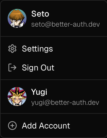
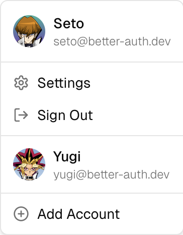
The <UserButton /> component provides an easy-to-use dropdown menu button that displays user account information and session management actions. It includes an avatar, provides quick access to user settings, linked accounts, and session management actions.
Installation
pnpm dlx shadcn@latest add https://stackproviders.github.io/better-auth-ui/r/user-button.jsonnpx shadcn@latest add https://stackproviders.github.io/better-auth-ui/r/user-button.jsonyarn dlx shadcn@latest add https://stackproviders.github.io/better-auth-ui/r/user-button.jsonbun x shadcn@latest add https://stackproviders.github.io/better-auth-ui/r/user-button.jsonUsage
import { UserButton } from "@/components/auth/user-button";

export default function Navbar() {
  return <UserButton />;
}
Usage
import { UserButton } from "@/components/auth/user-button";

export default function Example() {
  return <UserButton />;
}
Reference
These are the available props for the <UserButton /> component:
| Prop | Type | Default |
|---|---|---|
localization? | AuthLocalization | authLocalization |
disableDefaultLinks? | boolean | - |
trigger? | any | - |
additionalLinks? | { href: string; icon?: any; label: ReactNode; signedIn?: boolean | undefined; separator?: boolean | undefined; }[] | - |
sideOffset? | number | - |
side? | "top" | "right" | "bottom" | "left" | - |
alignOffset? | number | - |
align? | "center" | "start" | "end" | - |
classNames? | UserButtonClassNames | - |
className? | string | - |
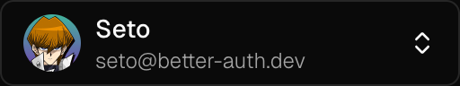
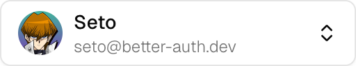
Examples
Icon Size Button
The size="icon" prop turns the UserButton into a small button, showing only the user's avatar. This is the default size.
import { UserButton } from "@/components/auth/user-button";

export default function Example() {
  return <UserButton />;
}
Full Width Button
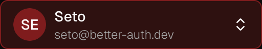
The size="full" prop turns the UserButton into a wide button, showing the user's avatar, name or email, and dropdown arrow. Recommended for desktop user menus.
import { UserButton } from "@/components/auth/user-button";

export default function Example() {
  return <UserButton size="full" />;
}
Styling
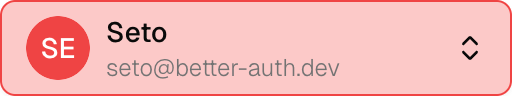
You can fully customize the appearance of the UserButton component with UserButtonClassNames using the classNames prop.
Here's an example that drastically customizes the styling:
import { UserButton } from "@/components/auth/user-button";

export default function Example() {
  return (
    <UserButton
      className="border-destructive w-64 bg-destructive/30"
      classNames={{
        content: {
          avatar: {
            fallback: "bg-destructive text-white",
          },
        },
      }}
      size="full"
    />
  );
}