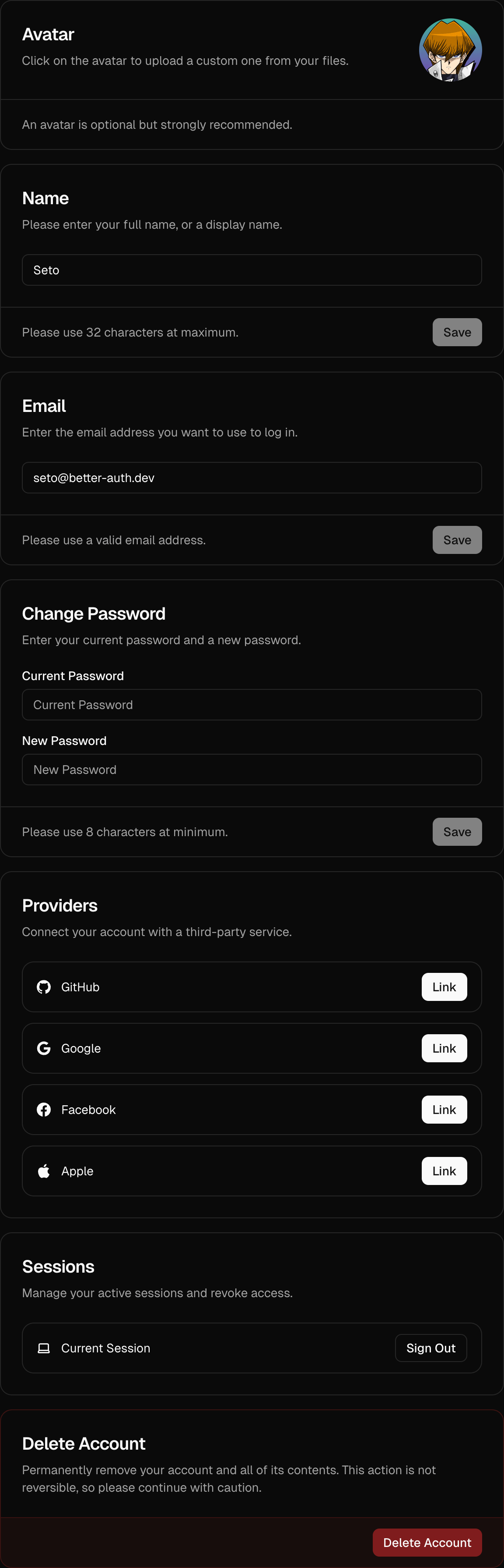
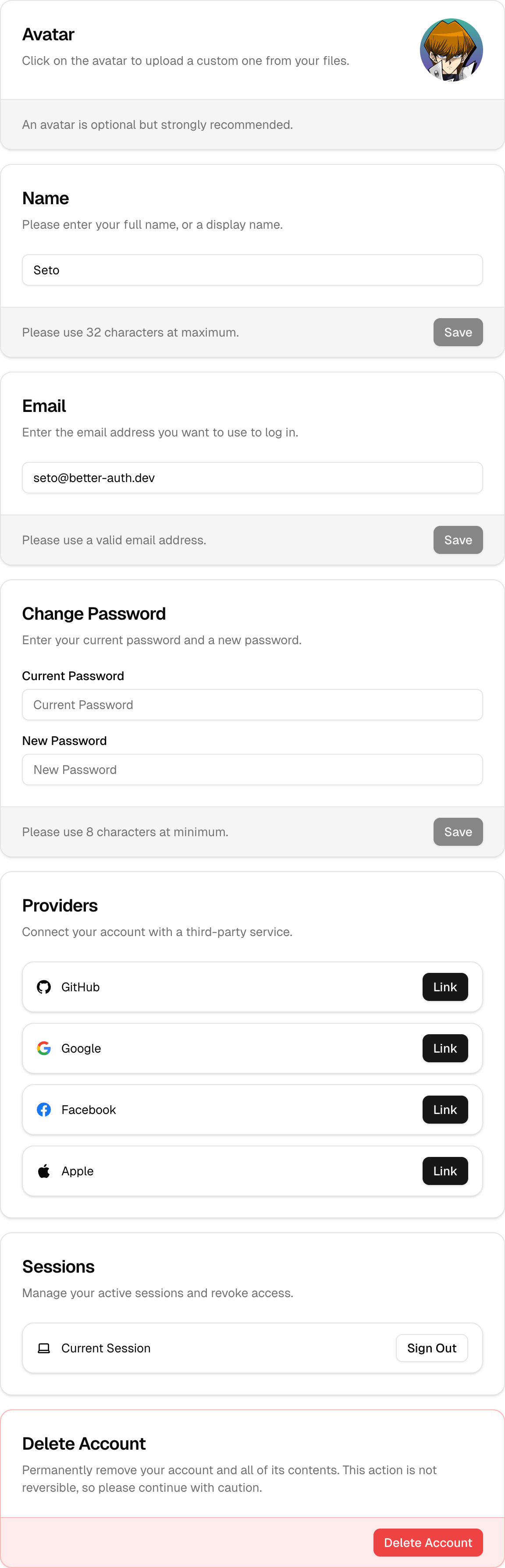
<AccountView />
A complete account management dashboard, including settings, security, API keys and organizations.
The <AccountView /> component is a high-level component that provides a comprehensive user account management dashboard. It includes a navigation sidebar (or drawer on mobile) to switch between different settings sections.
Installation
pnpm dlx shadcn@latest add https://stackproviders.github.io/better-auth-ui/r/account.jsonnpx shadcn@latest add https://stackproviders.github.io/better-auth-ui/r/account.jsonyarn dlx shadcn@latest add https://stackproviders.github.io/better-auth-ui/r/account.jsonbun x shadcn@latest add https://stackproviders.github.io/better-auth-ui/r/account.jsonUsage
import { AccountView } from "@/components/account/account-view";

export default function SettingsPage() {
  return (
    <div className="flex justify-center py-12 px-4">
      <AccountView className="max-w-4xl" />
    </div>
  );
}
This component automatically leverages all the features you have enabled via the <AuthUIProvider /> and provides a seamless user settings UI out of the box.
Default Settings Page Behavior
By default, the built-in <AuthView /> component automatically creates links to the settings views managed by <AccountView />. If you prefer to handle user settings on a custom route or component, you can override this behavior using the settings.url prop.
Overriding Built-in Settings URL
To use your own custom settings route and avoid using the default included settings card, you can specify the account.basePath prop within your <AuthUIProvider /> configuration:
import { AuthUIProvider } from "better-auth-ui";
import { authClient } from "@/lib/auth-client";
import { useRouter } from "next/navigation";
import Link from "next/link";

export function Providers({ children }: { children: React.ReactNode }) {
  const router = useRouter();

  return (
    <AuthUIProvider
      authClient={authClient}
      navigate={router.push}
      replace={router.replace}
      onSessionChange={() => router.refresh()}
      account={{
        basePath: "/dashboard/settings", // Your custom settings page URL
      }}
      Link={Link}
    >
      {children}
    </AuthUIProvider>
  );
}
By setting the account.basePath as shown above, the built-in links will also automatically point to your specified /dashboard/settings page.
Sections Included in AccountView:
- Account Settings: Managed by
<AccountSettingsCards /> - Security: Managed by
<SecuritySettingsCards /> - API Keys: (If enabled) Managed by
<ApiKeysCard /> - Organizations: (If enabled) Managed by
<OrganizationsCard />
Customization Options
You can customize the UI extensively by passing TailwindCSS classes or customizing provided class names through the classNames prop.
Customizing Styles with classNames
Using Tailwind utility classes, you can fully customize all card states. Here's an example:
<AccountView
  className="max-w-4xl mx-auto"
  classNames={{
    card: {
      base: "border-blue-500",
      header: "bg-blue-50",
      title: "text-blue-600 text-xl",
      description: "text-muted-foreground",
      content: "bg-blue-50",
      footer: "bg-blue-500/5",
      button: "text-white bg-blue-600 hover:bg-blue-700",
      input: "bg-background placeholder:text-muted-foreground/50",
    },
    sidebar: {
      base: "border-r border-blue-100",
      buttonActive: "bg-blue-100 text-blue-700 font-bold",
    },
  }}
/>
Reference
| Prop | Type | Default |
|---|---|---|
hideNav? | boolean | - |
view? | "SETTINGS" | "SECURITY" | "API_KEYS" | "ORGANIZATIONS" | - |
pathname? | string | - |
path? | string | - |
localization? | Partial<{ INVALID_USERNAME_OR_PASSWORD: string; EMAIL_NOT_VERIFIED: string; UNEXPECTED_ERROR: string; USERNAME_IS_ALREADY_TAKEN: string; USERNAME_TOO_SHORT: string; USERNAME_TOO_LONG: string; ... 358 more ...; UNKNOWN: string; }> | - |
classNames? | { base?: string | undefined; cards?: string | undefined; drawer?: { menuItem?: string | undefined; } | undefined; sidebar?: { base?: string | undefined; button?: string | undefined; buttonActive?: string | undefined; } | undefined; card?: SettingsCardClassNames | undefined; } | - |
className? | string | - |